Posts

Final Designs

Image
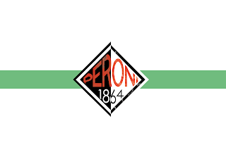
Shown above are my final designs for the project. I have used a range of colours to indicate flavourings. After testing colours I finally used a two tone effect, giving the design some further depth. You can also see how I have altered the design in order to fit in the name of the flavour. This creation of space doesn't interfere with the layout of the final illustrations.  Show below is a one colour concept featuring a bottle neck strap. This colour choice was effective but I think the design lacked depth. The bottle neck idea also had good potential but I thought the design was effective enough and the design on the bottle neck would ruin the effect. I also thought the bottle neck design wasn't as well refined and didn't look as appealing on the eye. 

Label Bottle Testing

Image
Shown above is an example of the Peroni concept label on a bottle. I think the general concept and design works well but I am not happy with the border around the design. To move forward I will need to test the design without the beige border in order to get an understanding as to whether this would be an improvement.   Below I have shown a strap that would be placed on the neck of the bottle. The design concept is at its early stages and I will need to see if it looks effective on the bottle. I am also not 100% happy with the look of the design so this will need to be altered further. The sun is meant to be represented within the circle and I don't think this comes across easily to viewers. 

Illustrations logo idea

Image
Above and below I have show another concept I have created. Below I have shown an illustration drawn in one of my classes. The sun in the illustration is something I want to use in the design of my label, it creates an eye catching aspect. Colours is also something I need to concentrate on as the green and orange, red and beige, don't connect with the Peroni colours.

Altering the design

Image
 I am now looking to explore another angle in my production of the Peroni labels. I have created a hand drawn design that uses a dotted gradient. The initial design I had created wasn't to my liking so I decided to experiment hand drawing logo designs. I think the design above and below is attractive but still needs to be altered in order to look effective on a glass bottle. 

Further label development

Image
Moving on from my previous design I have started to look at holding the text within the centre of the diamond. This gives a more compact and tidy look, making it more appealing. I am still struggling with a colour scheme that works with the composition and layout. My goal is to develop the layout further and find a colour scheme that will suit the Peroni brand. I may have to revert back to Peroni's traditional colours.

Initial Logo Ideas

Image
I started developing the logo by using a wrap around design. I have been centralising the colour around light and dark blue along with red. I have also followed design that links to my research on old Italian advertisements and design within that era.  In the images shown I am playing around with different compositions. I haven't yet found one that looks appealing and striking on the eye. I am going to continue developing this idea. 

Contrast Poster

Image
Shown above is the original arrangement of the contrast poster. In this poster, I am showing the contrast between a bird covered in oil and a bird untouched. This is representing oil spills that cause massive harm to ecosystems in the ocean and on coastlines. I am happy with the use of two birds that create contrasts between colour. I was not completely happy with the layout as it is not as effective as my other productions. The background of the poster is also too dark and doesn’t bring out the colours in the white bird. By brightening the background, it will make the white of the bird become more prominent.   Shown above is my final design of the contrast poster. I changed the layout to help make the white bird show freedom and health compared to the bird covered in oil. This layout fills the page and makes it more interesting to look at. The white bird also signifies hope in keeping wildlife safe from negative human effect.