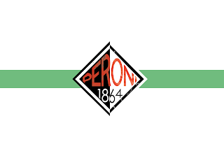
Further label development
Moving on from my previous design I have started to look at holding the text within the centre of the diamond. This gives a more compact and tidy look, making it more appealing. I am still struggling with a colour scheme that works with the composition and layout. My goal is to develop the layout further and find a colour scheme that will suit the Peroni brand. I may have to revert back to Peroni's traditional colours.


Comments
Post a Comment